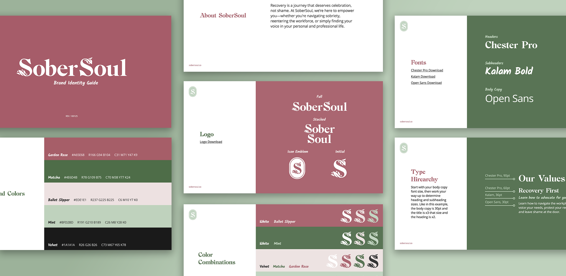
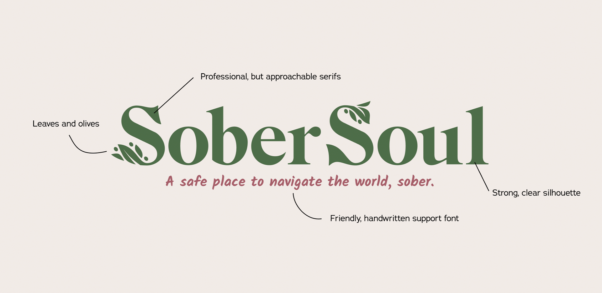
SoberSoul
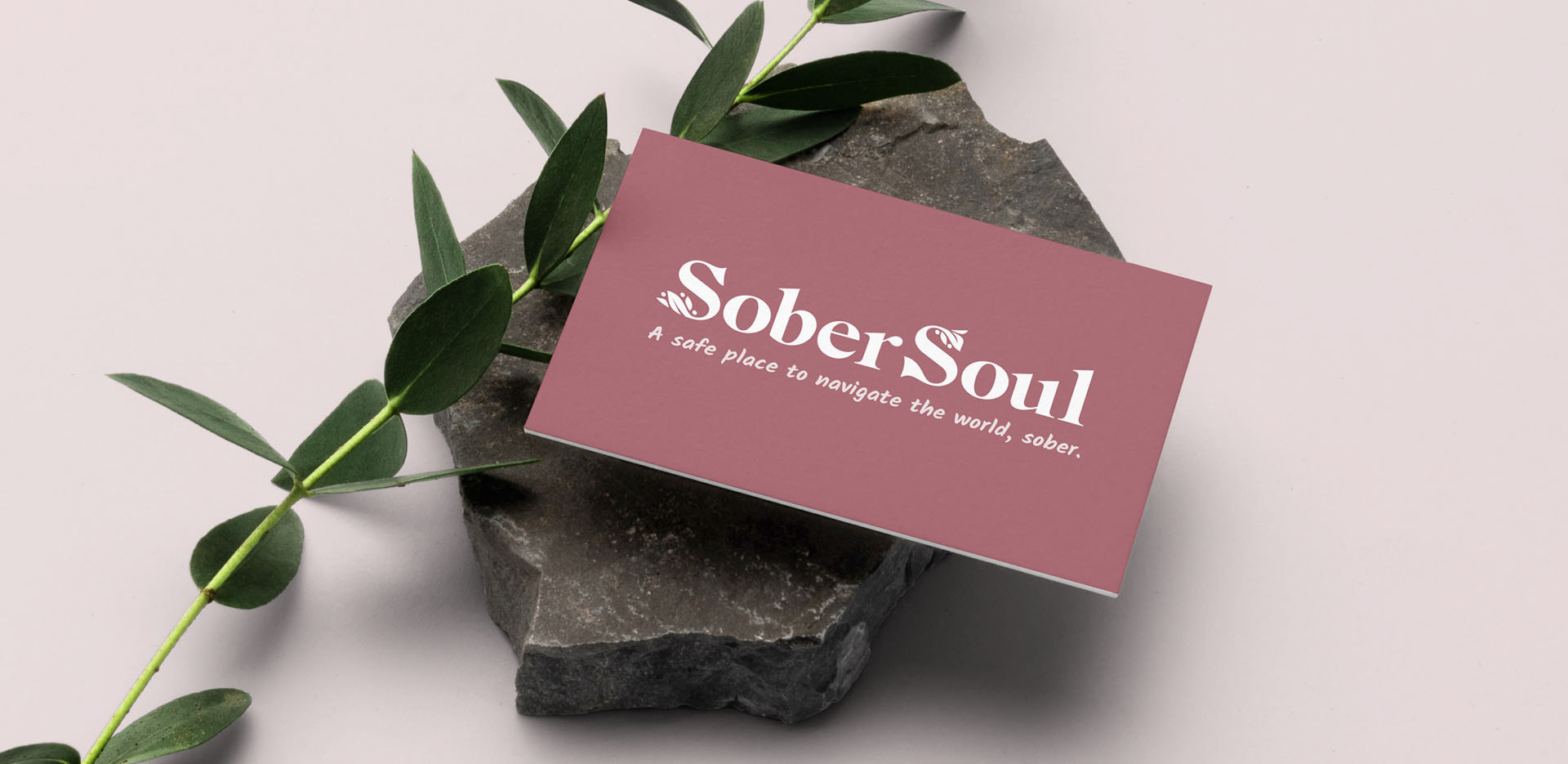
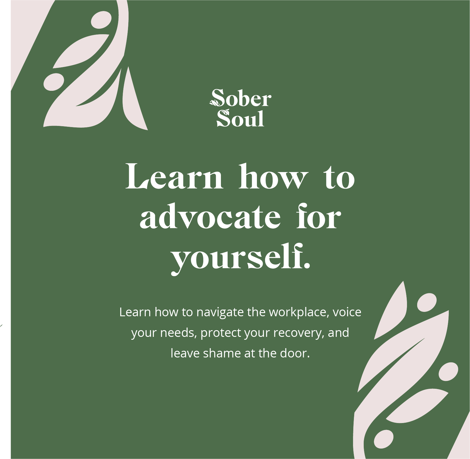
Whitney started SoberSoul to create a safe and supportive space for sober professionals. She helps people empower their sobriety, reenter the workforce, and find their voice in their personal and professional life. To launch this new endeavor, she wanted an inviting visual identity that would comfort and inspire her clients.
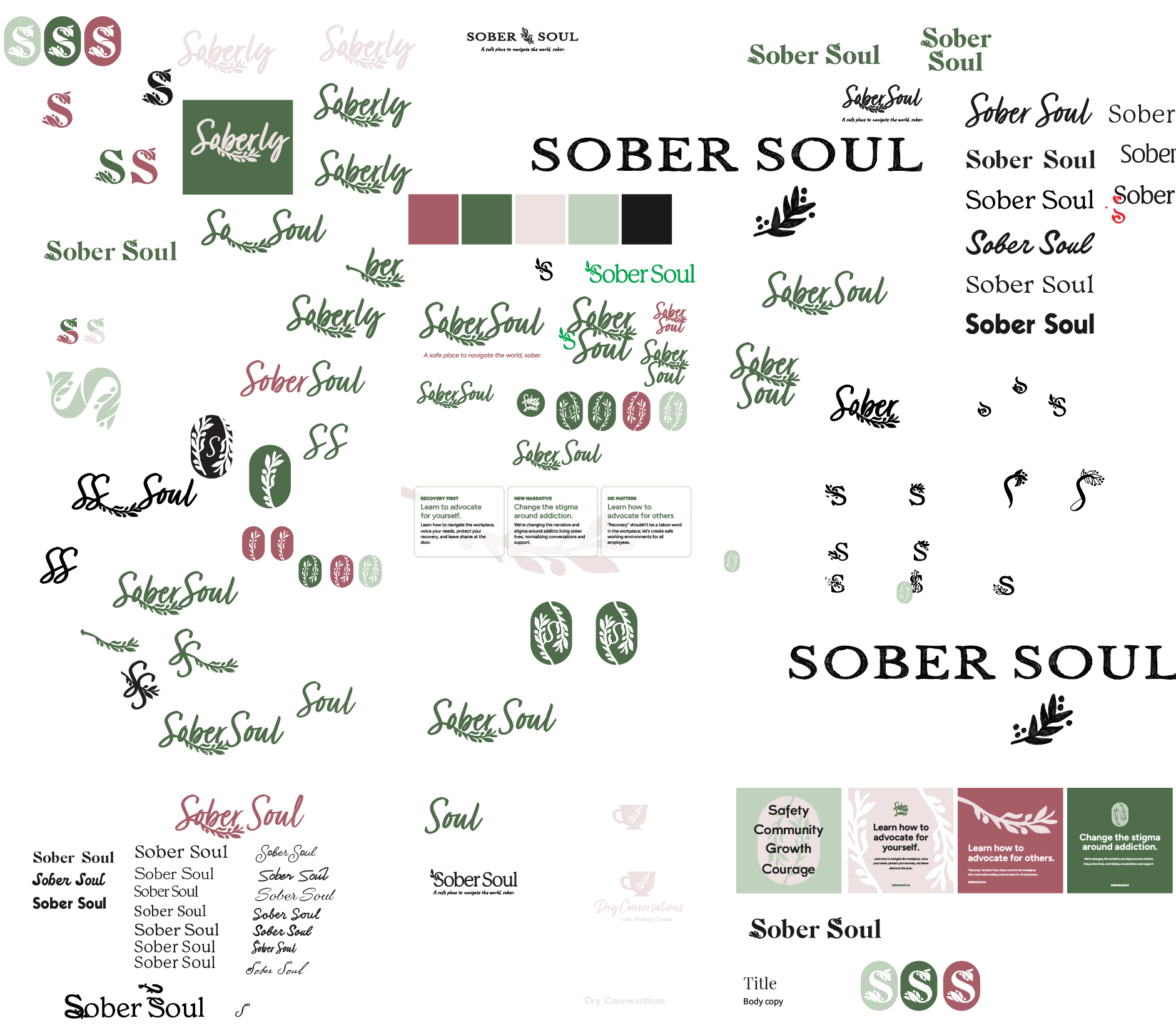
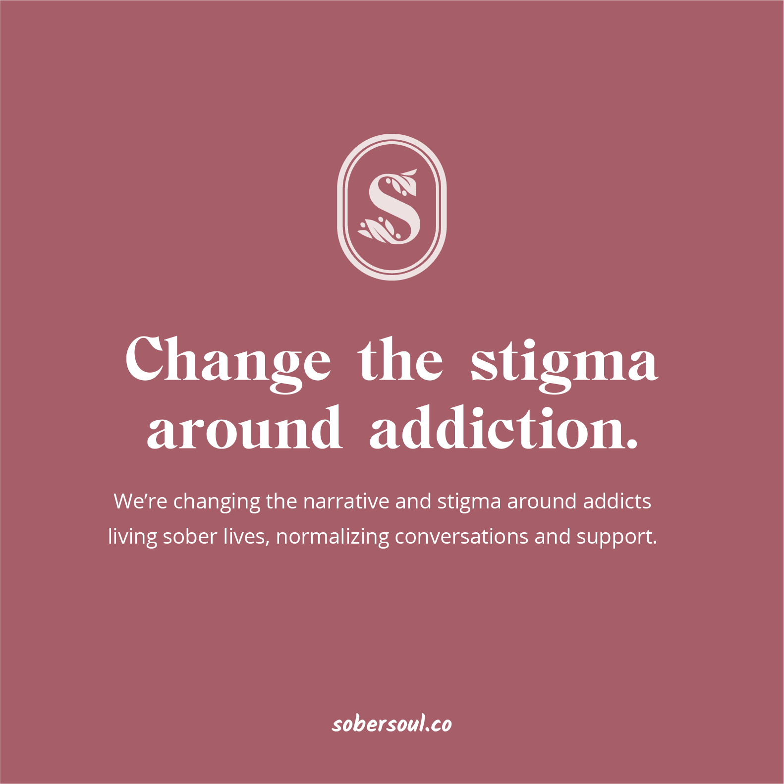
Safe space, community, and good conversations
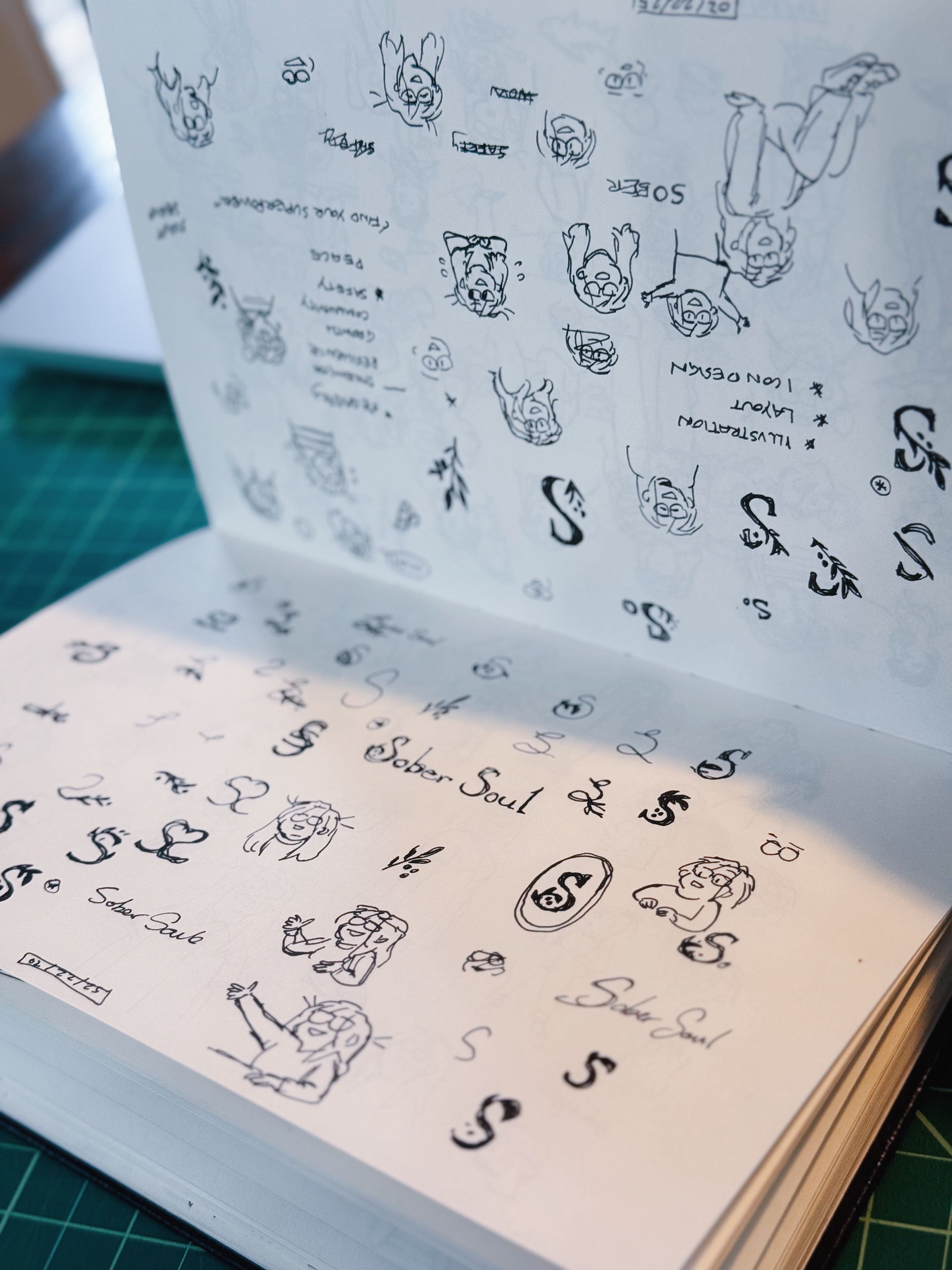
Mimicking cozy coffee shops or spring gardens, the main themes to emphasize were growth, specifically olive branches, and belonging. Soft colors and hand-written typefaces were explored, but a need for an edge of professionalism was necessary to ensure long-term value as SoberSoul grows.
Accessible deliverables
Knowing that SoberSoul was starting as a one-woman operation and most design work would be done in Canva, all deliverables were made simple. The brand identity guide was short with links to access typeface downloads and logo files, as well as some easy layout and color combination guides.